Go Fresco
Web Design/ UX/UI Design
Overview
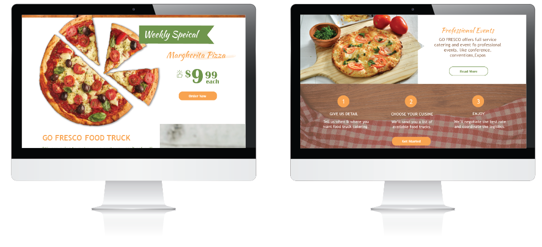
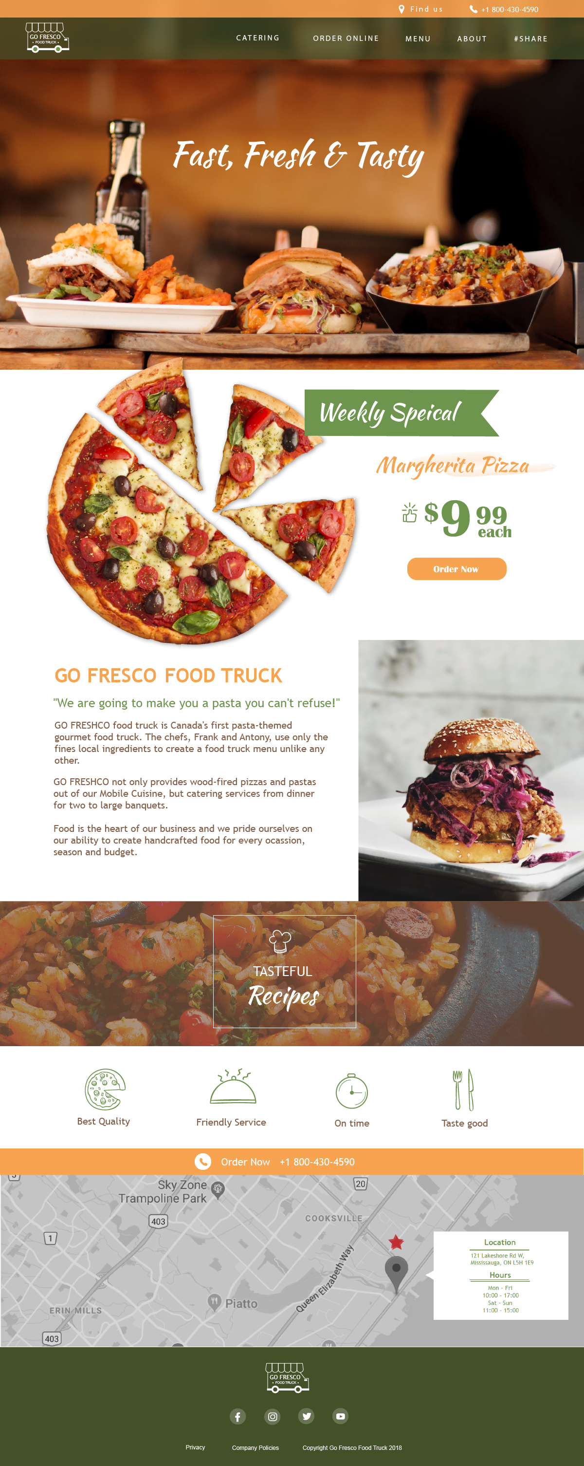
Go Fresco is a fictional pasta-themed food truck business, designed for people who like Italian food and offer the fast food service. Home page and Catering page are created to briefly demonstrate how this food truck business offers distingushing service to customers.
Go Fresco uses red, green and orange colour to make the theme more closed to Italian colour palette. Go Fresco also features new catering and online order service, dedicated to provide great customer experience to people.
Responsibilities
Web Design/UX/UI Design /User Experience/Wireframes/
Logo Design/ Branding
Branding


Challenge
Since the website is designed for a food truck service, relevant images must be used to match the theme of discussed topic. It is not exaggerated to say that a considerable amount of time was spent to obtain food truck related images since the online sources are very limited. Another obstacle that hindered this particular website design process would be finding alternatives to implement marketing plant, improve business revenue and increase popularity. Brainstorming method is used to create ideas to improve food truck business model. In this case, Go Fresco has used different business approach to improve customer service and experience, for example offer online order service and catering order booking for some special occasions.
Styletiles


Wireframes
Home Wireframes

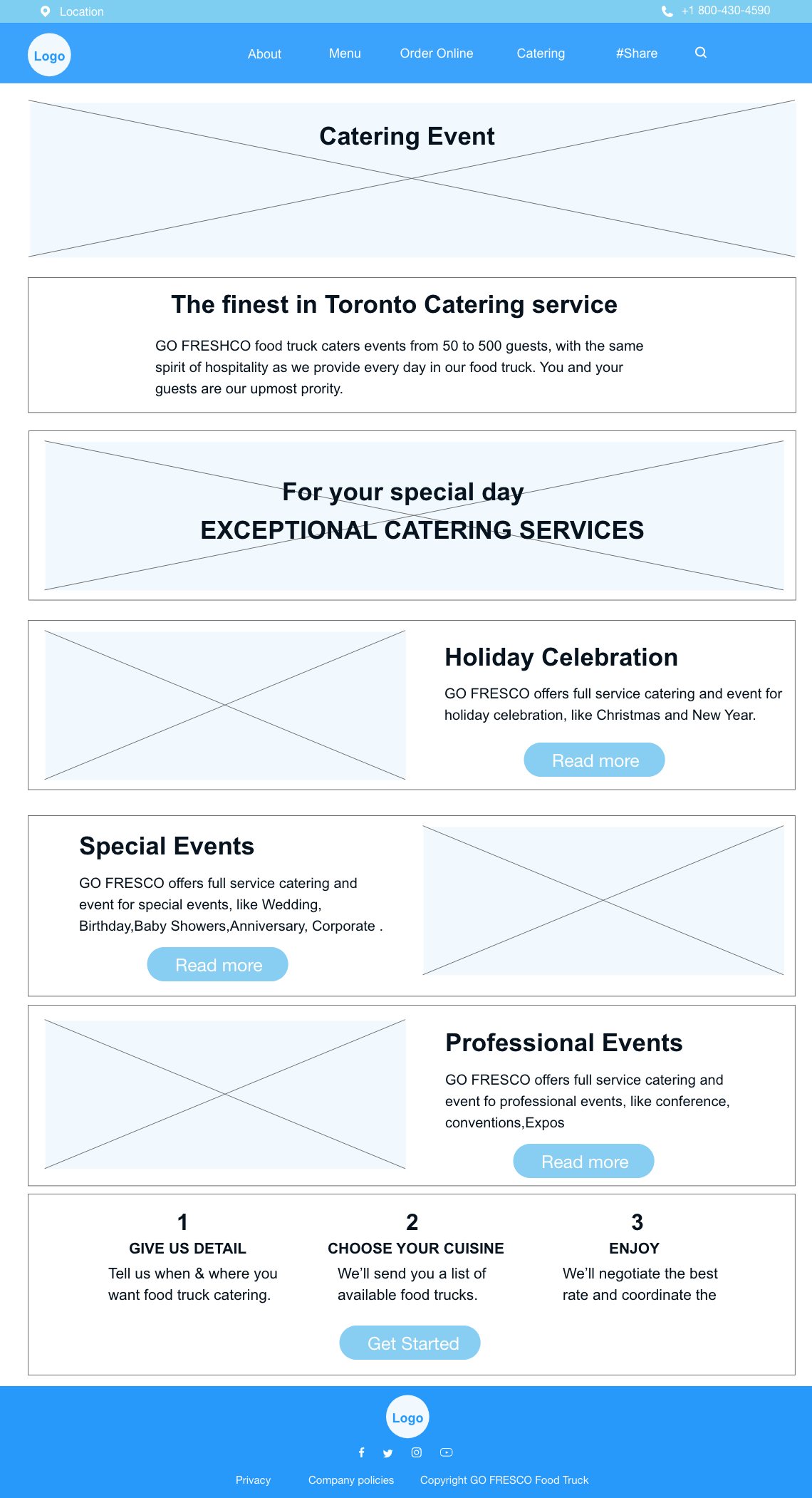
Catering Wireframes

Page design
Home Page

Catering Page


