Secret Garden
Web Design/UX/UI Design
Overview
Secret Garden is a fictional terrarium store, designed for people to enjoy the creative experience to explore nature and build their unique terrarium in different themes.
This project focuses on web design and web development, which aims to create a user-friendly browsing experience for all the people. People can experience the fun and entertaining design process for example how to customize their creative terrarium on the online platform or in terrarium workshops.
Web Design/Web Development/UI,UX design/ /Marketing Plan
Branding/Logo Design/Sitemap/Wireframes
Branding


Problem
How to encourage people to join the terrarium workshops? How to create a relaxing environment and help the people to reduce their stress from study or work?
During the process of interacting with the imaginary plants, how can we provide a meaningful, entertaining, and creative ways for people to customize their terrarium?
Solutions
The business is competitive, which means there are lots of similar terrarium stores and workshops in the market, so I came up with an idea of having themed workshop, and people are welcome to create their own favourite theme of the terrarium, such as Pokemon, Star Wars, Disney and so on.
This website provides an interactive platform for people to build a terrarium creation, so they can enjoy the 4 simple steps to create the terrarium and we ship the terrarium to their address.
We encourage people to bring their containers/vessels to build terrarium, they can use a fishbowl, glass cup or lunch box, etc. This is such a great idea to that you can help to protect the environment by reducing the waste and having fun making terrarium at the same time .
The web design and web development have to be consistent for the users at all time, so they can always go to a specific page without too many clicks or steps.
Design Process
Secret Garden is a semester-long web design project. I started with a marketing plan and created two ideal personas, and validating design concepts from sitemap, wireframes, and styletyles. Along with the process, I’ve also gone through weekly design critique session from others and received the feedback to improve my work better.

Persona
I created the two ideal personas based on the research and marketing plan. I listed the users' stories, preferred channel, and motivation to better understand their needs and make the design to meet their requirements.


SWOT Analysis
SWOT Analysis provides a framework for analyzing the Secret Garden's business plan and better understand the strategy, position and future directions.
SWOT Analysis helps me to focus on the strengths, be aware of and minimize weaknesses, take advantage of opportunities, and be prepared for any potential threats.


Customize Your Terrarium

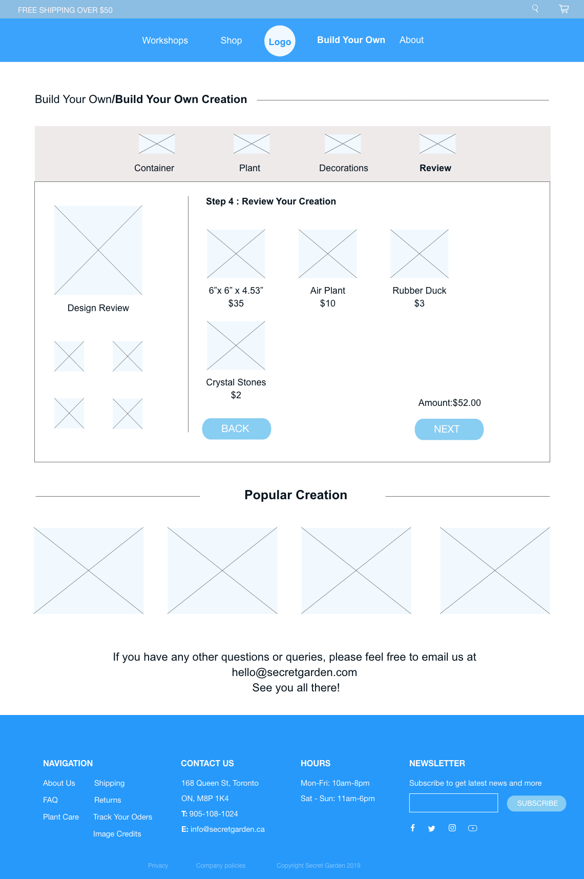
People can experience the online customization process and build their secret garden by following these 4 easy steps: choose the container, succulents, decorations and then review it before submitting to the completion page.
M Garden

Secret Garden also features an app for users which includes another prominent attribute - a fun Augmented reality(AR) experience to allow users to interact with their decorative character and terrarium.
In the Augmented reality game, users can enjoy the interactive experience of a real-world environment to find the hidden gems, catch them and level up their terrarium profile. You can invite your friends to join you and have fun together.
Users can also enjoy the process of growing terrarium by watering, planting, growing, and decorating process. We have inserted tons of surprise to be explored and always ready to bring more excitement to everyone.
Logo Design

Site map

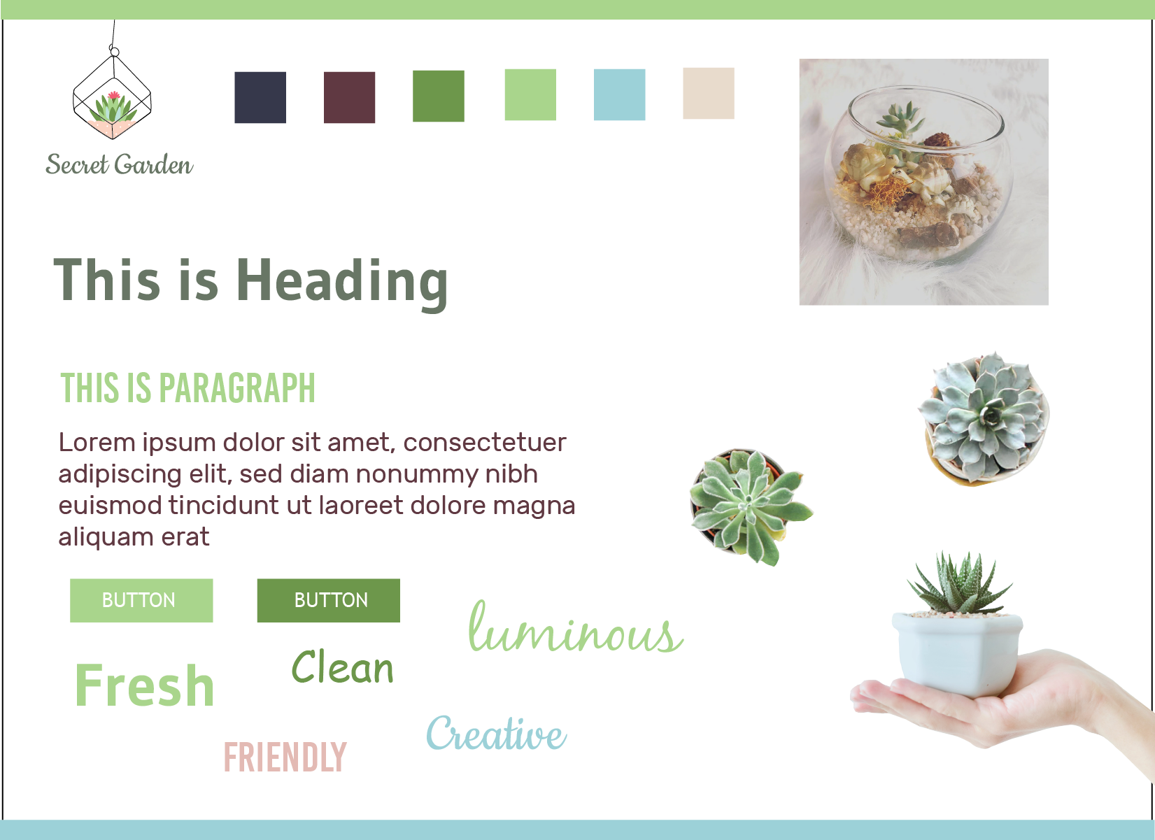
Styletiles
I designed two different styletyles with different logos, colour palettes, typographys, and image styles.

Wireframes
Home Page

About Page

Workshop Page
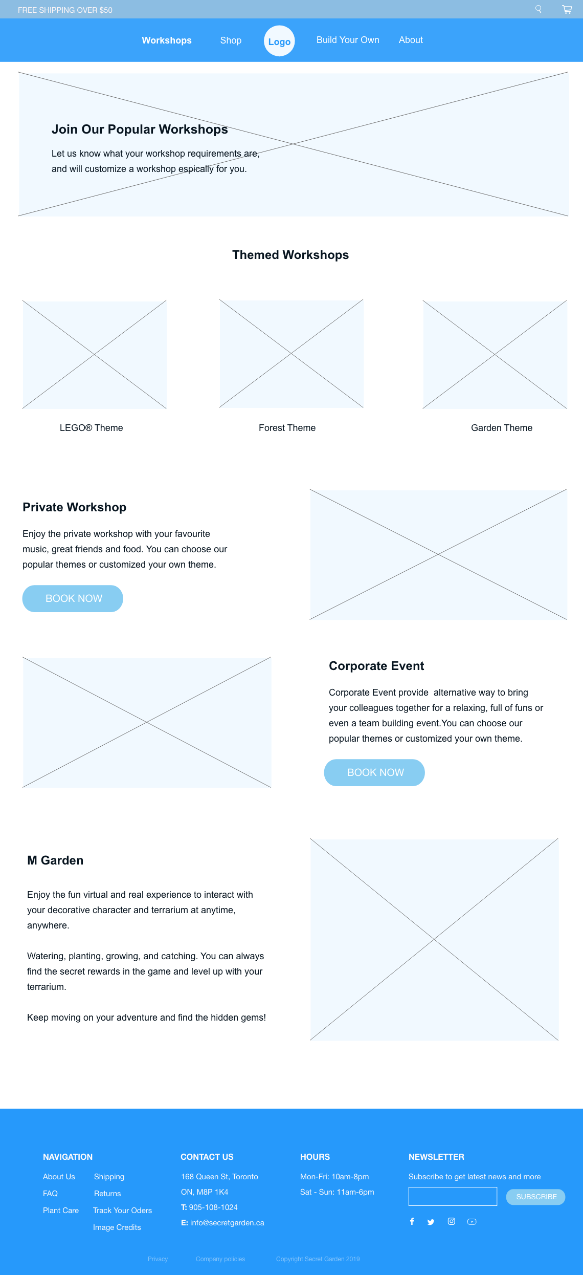
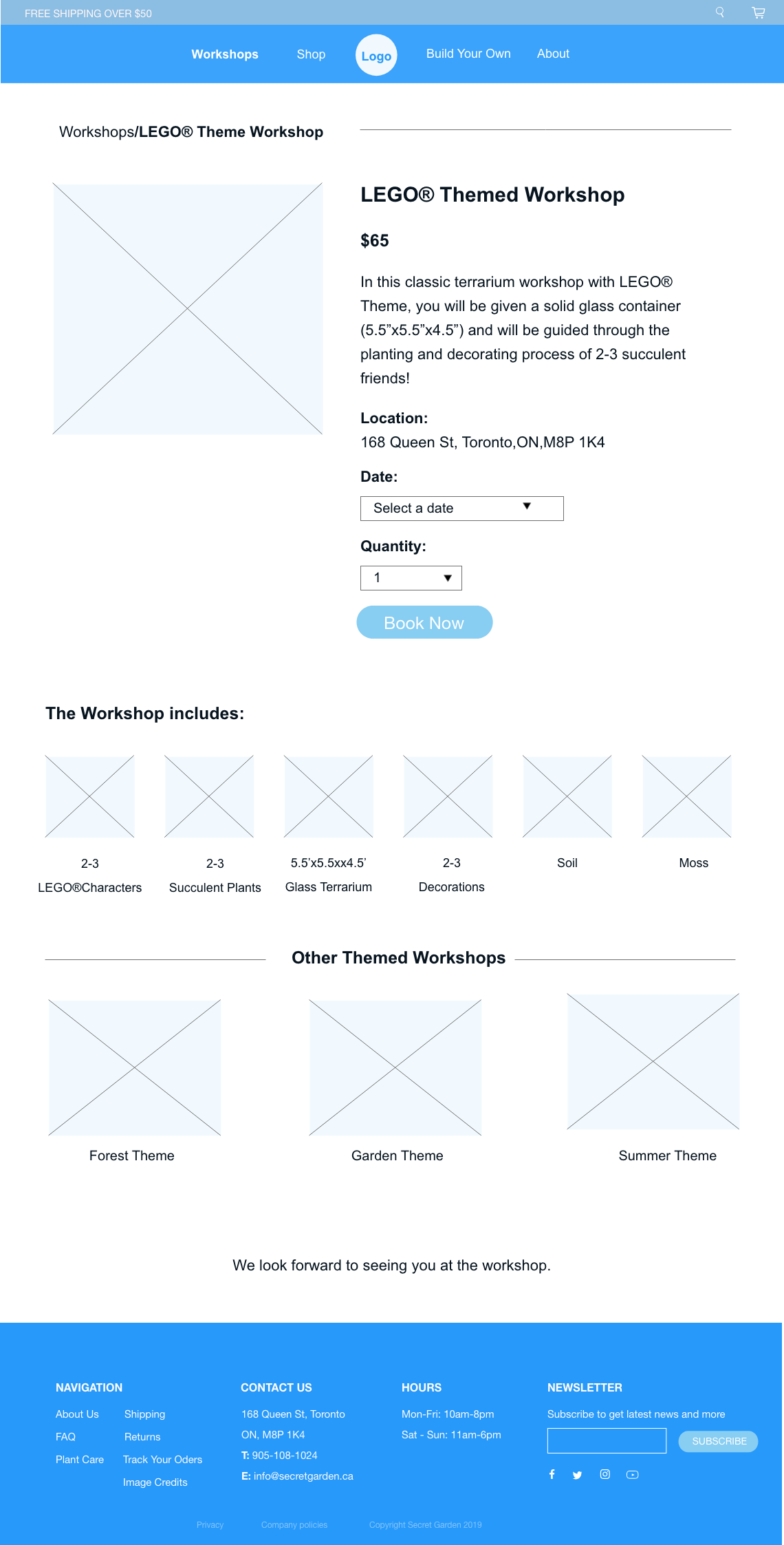
Themed Workshop Page
Shop Page

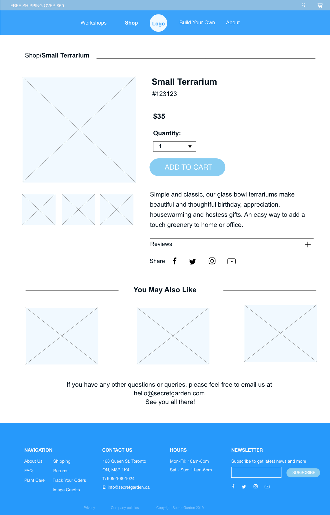
Shop Details Page
Shopping cart Page

Build your own
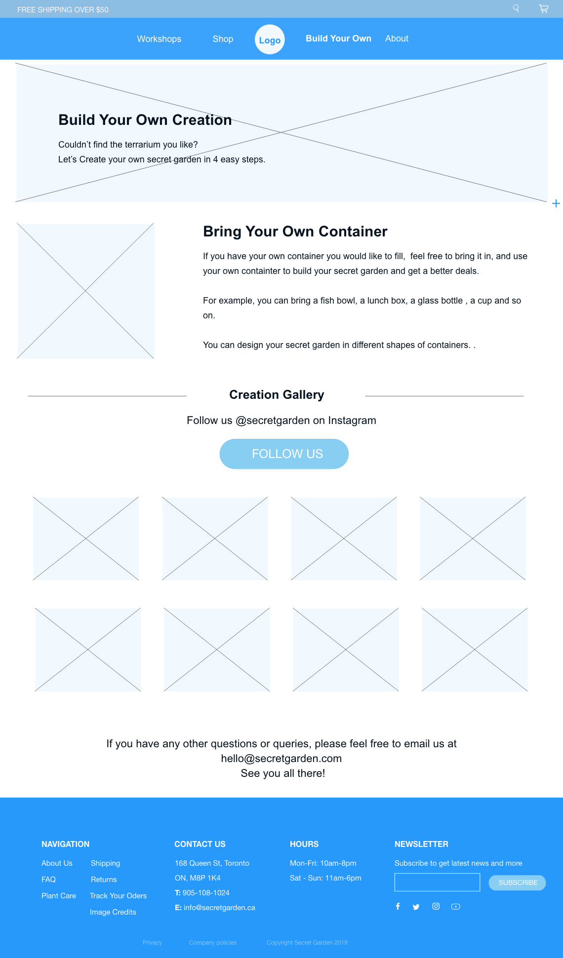
Build Your Creation-Step1

Build Your Creation-Step2

Build Your Creation-Step3

Build Your Creation-Step4
Initial page designs
Following the two different design styles, I further created two initial home page designs and see which design looks better for the concept of Secret Garden.
In the end I’ve chosen the left side design style, which is more modern and simple to the users.
Home Page Style1

Home Page Style2

Final Page designs
Based on the selected style and initial page design, I continued to design the remaining web pages.Finally, I developed my design through HTML/CSS, and JavaScript.
Home Page

About Page

Workshop Page

Themed Workshop Page

Shop Page

Shop Details Page
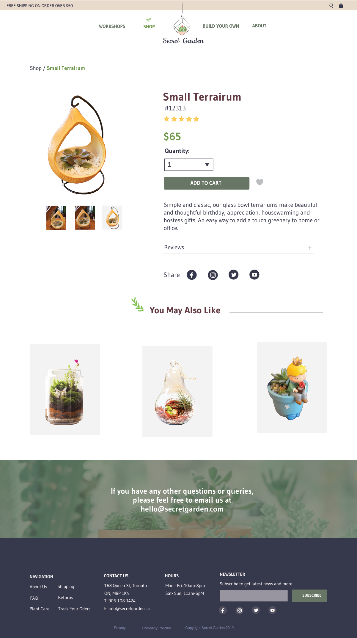
Shopping Cart Page

Build Your Own

Build Your Own Creation-Step1

Build Your Own Creation-Step2

Build Your Own Creation-Step3
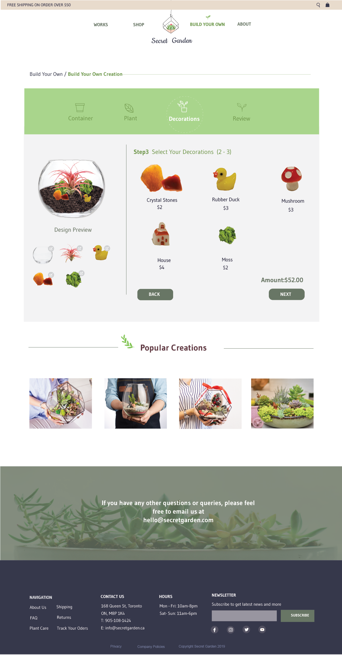
Build Your Own Creation-Step4


